15 Best Online Accessibility Practices

Accessibility is important to make social media, websites, and digital resources available for all people, especially people with disabilities. However, it can take time to learn how to make your online space more accessible. We've created a list of our 15 best accessibility practices to make it easier for you to learn and implement accessibility online. 

1. Alt text

  •  Alt Text is most often used to provide people who are blind and low vision access with online visual information.

  • Watch or read Rooted In Right's video on alt text below. 

Alt Text in a Snap - #AccessThat

2. Font

  • It is best to use San Serif fonts for most text. These are fonts that do not have accent marks or decorative features on the letters. Because they are plain, san serif fonts are easy to read. Examples of san serif fonts include: Arial, Calibri, Helvetica, Tahoma, or Verdana.
  • It is also good practice to only use bold and italics sparingly. You should use bolds and italics to emphasize a really important point, and you should not use bolds and italics throughout an entire document.
  • You can use Serif fonts in larger sizes, like headlines and headers. It is just important to be mindful of when you are using serif fonts that it is large enough to be easily legible.

Names of accessible san serif fonts in their font. Fonts are Arial, Calibri, Helvetica, Tahoma, and Verdana

3. Color contrast

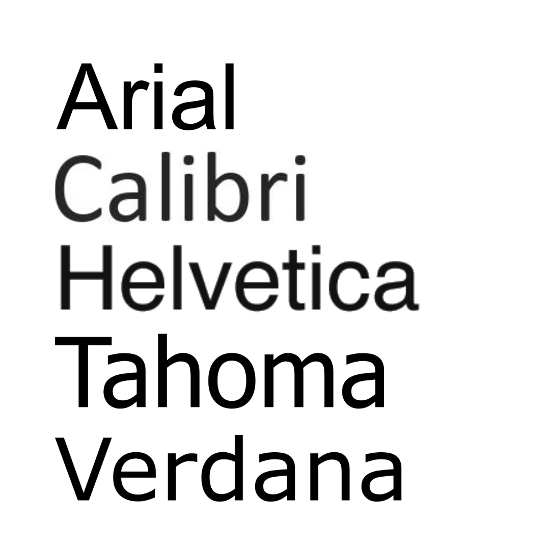
  • When creating graphics or content, make sure to have high color contrast so that people can easily read what you are saying.

  • Use WebAim’s website to check color contrast.

Example of good and bad color contrast. yellow text on orange background shows weak color contrast and black text on beige background shows strong color contrast

4. Hashtags

  • When writing hashtags on social media, use CamelCase! CamelCase means you capitalize each word in the hashtag to make it easier to read. Not only is it easier for everyone to read when each word is capitalized, screen reading software can better read out a hashtag to a user if the words in it are capitalized. If you do not capitalize each word, it can be very difficult to understand what the hashtag is saying, especially if it's very long.

  • Take the phrase ‘disability rights are human rights’ as an example. If you were to put those words in a hashtag and didn’t capitalize each word, it may look like a long list of letters that are hard to discern. When you use CamelCase and it reads #DisabilityRightsAreHumanRights, it is much easier for folks to read.

  • One final thing about hashtags, put them at the end of social media posts when possible. It is easier for everyone and for someone using a screen reader to read if there’s no mix of plain text and hashtags throughout a post.

    • This can be difficult on Twitter because of the character limit. It is okay to use some hashtags in the main message of the tweet but try not to use too many.
    • In addition to hashtags, also put tags (when you tag or mention a person or organization using the @ [at] symbol) at the end of posts.

graphic of a camel with 2 humps to showcase the concept of camel case

5. Plain Language

  • Plain text simply means using language that is most accessible for all people. This includes limiting any use of academic or elevated jargon, providing definitions for academic/elevated words if they must be used, listing out what any acronyms mean, using active voice, using bullet points or numbering content, and ordering information logically with the most important information first.  You also can utilize images or graphs to help explain something. This is a good idea because a concept may be difficult to comprehend through text, or will make the information in the text more clear, or people who cannot read or prefer visuals can access that information in a way that works best for them.

  • You can check how accessible your text is by checking the reading level with Hemingway app. This app will evaluate your writing and give you a letter grade based on how easy it is to read. At our organization, we try to have our messages fall between a 6th and 8th grade reading level. If you notice that your message is scoring much higher than that, try to rephrase your message and share it in the simplest terms possible.

  • Review how the responses to the question 'What is Covid-19?' below are different. The first answer is more academic and at a higher reading level, whereas the second is more accessible at a lower reading level.

6. Text spacing & alignment

  • To make your Instagram captions and comments easier to read, add spaces in between main message points. 
  • Be mindful of how you have text aligned on a document, PowerPoint, or social media post. Some alignments may make things harder to read.
  • Here are some popular ways to align text:
    • Left aligned: Standard alignment, text comes from the left side of a document, easiest for people to read
    • Right aligned: Text comes from the right side of a document. Only use when left cannot be utilized, be mindful not to overuse it
    • Center aligned: Text comes from the center of a document. Okay to use but be mindful to not overuse it.
    • Full width text: Text is spread out to fill a document.  Avoid using full width text. Large and inconsistently sized gaps between words make it difficult to read.

Text of disability rights Florida's mission statement in the 4 different alignments mentioned. each alignment showcases the pros and cons of the text alignments provided

7. Links

  • When adding links to a document, online newsletter, PowerPoint, or website, embed the link whenever possible. To embed a link, highlight text and connect the link to that text. When you click on the text, it will take you to that link.

    • Something important to keep in mind: When writing the text that you will embed the link in, describe where the link takes you. Say something like ‘Listen to our latest podcast episode on our website’. Do not just say ‘click here’. People using screen readers need to know where a link is taking them. When you describe where the link will take a user, it makes your message clearer for people to understand.

  • For social media, we cannot embed links within a post’s text. Instead of pasting a long link to a website, run that long link through a link shortener (bit.ly or tiny.url (free)). Screen readers will be able to read the short link quickly, rather than listing out a long string of numbers and letters that can be confusing (and annoying!) to a user.
  • Another way to consolidate and embed links on social media is to use a link organizer in your bios, such as link.tree, to share important information

8. Captioning

  • Captions provide a real-time on-screen text version of everything spoken within a video as well as any relevant sounds, music, or intonation. They help all sorts of viewers understand video content – whether you're Deaf, Hard of Hearing, forgot your headphones or just like to read along. (Rooted in Rights)
  • Another way to be accessible in captioning is providing subtitles in other languages! Subtitles differ from captions because they are not in the same language as the audio content. When you translate your audio content into other languages, you are not just breaking down accessibility barriers, but language barriers too!

Watch Rooted in Rights's video on Captioning below. 

Captions in a Snap - #AccessThat

9. Audio Descriptions

  1. An audio description is a verbal description that conveys important visual information. It can help people who are blind and low vision fully understand things like video, events, artworks or locations. First, make sure to talk your text. If you are relying on your audience to receive information by reading, your video is not accessible. Avoid this by making sure you narrate all important text that appears on screen. Second, Have the people in your videos introduce themselves as they appear. This way, it's easier to identify speakers and differentiate between them throughout the video. Third, If a scene or moment is purely visual, like if a magician silently pulls a white rabbit from her top hat, or with the tap of her black wand makes her assistant disappear, it needs to be described. (Rooted In Rights)

  2. Try watching the videos you make with your eyes closed. What critical information are you missing?

Watch Rooted In Rights's video on Audio Descriptions below.

Audio Description in a Snap - #AccessThat

10. Acronyms

  • Generally, you want to limit using acronyms too much. Always list out the acronym in full before defaulting to using any acronym.
  • For example: Disability Rights Florida can be reduced to the acronym DRF. But in any publications or media, we always list out our full name, Disability Rights Florida, before associating it with the acronym DRF. This ensures that everyone understands acronym before repeated use.
  • Being mindful about acronyms is practicing good plain language – be mindful of acronyms that are for your profession or are applicable only at an elevated academic setting

11. Content Warnings

  • Some topics may be distressing and harmful for people to engage with. To create a safe environment for someone reading your content, offer content warnings when there is any reference to violence or abuse. It is important to give viewers the opportunity to engage or not engage.
  • For example, you can say something at the beginning of a post or webpage that says: ‘Content Warning: Mentions of violence against people with disabilities, eugenics, ableism, and racism. Please proceed reading at your own discretion and pace. Take breaks as needed.’
  • By providing this content warning, you give power back to individuals who may have experienced a traumatic event and would like to avoid engaging in content that discusses that topic.

12. Use heading styles and formatting

  • When formatting documents, be sure to utilize the program’s style formatting settings to distinguish between headings, paragraphs, etc. When you do this, you’re classifying and tagging parts of your documents as titles, paragraphs, quotes, etc.
  • Think of it this way: If you were to take away all design elements, photos, graphics, arrows, etc. from your document, would you still be able to navigate it and find what you were looking for quickly? When you use the formatting labels, you essentially create an outline of your document. This is very important especially for individuals who are blind and use screen readers. A screen reader will read things in an outline order. If you have these formatting labels set up, someone using a screen reader can jump to whatever topic they need on your document by quickly finding what information is relevant to them through this outline format. However, if you have everything on your document listed as being general/paragraph text, it will take that user much more time to sift through the information to find what they need.

screenshot of microsoft word. the styles part of the toolbar is highlighted to show that you can select headings and other formatting options

13. Web accessibility overlays – and why you should never use them

  • An accessibility overlay is a website add-on that claims to fix any accessibility issues your website might have. Common ones are AccessiBe and UserWay, but there are many others. They often make claims that they can instantly transform an inaccessible website into an accessible one. The problem is that it’s just not true!

  • You can learn much more about accessibility overlays at the websites ‘Should I Use an Accessibility Overlay’ and ‘Overlay Fact Sheet’.

14. Common Website Accessibility Issues

You don’t have to be a website developer or programmer to understand what can make a website inaccessible. Here are seven common issues a website could have that make it hard for people with disabilities to use it:

  1. Screen readers ignore images: There are images on the web that contain important information, such as logos and buttons. They need Alt Text (see item #1) so a screen reader user can understand that content.

  2. Webpage structure is missing or incomplete: Just like in a document, you can make headings and special content stand out visually by adding size, color, or different fonts to text. Problem is, that doesn’t help a screen reader user to identify if something is a heading, a list, or other specific types of content. Special formatting and style tags need to be used to convey that information.
  3. Forms are unusable: Screen reader users trying to complete a form will have a difficult time if they don’t know what content is supposed to go in each field. The labels on a form need to be connected to the relevant fields for the user to get that information.
  4. Poor use of color: As in item #3 above, bad color contrast can make a site very difficult to use for people with low vision. Choose colors wisely, and check the contrast using a tool such as WebAIM’s color contrast checker.
  5. Link text has no meaning out of context: Same as #7 above—make sure link text means something and doesn’t simply say “click here”.
  6. Multimedia missing captions/transcripts: Same as #8 above—use captions or transcripts to provide a written option for folks who are Deaf or hard of hearing.
  7. Content is confusing: Same as #5 above—keep content simple and easy to read.

Testing your Website

You can use an automated web accessibility test such as WAVE by WebAIM to find many common problems. However, be aware that no automated test can find everything wrong. For example, an automated test can determine if there is alt text on an image, but not if that alt text is helpful or not to the user.

There are also several manual tests you can perform yourself:

  • Unplug Your Mouse
    • Can you navigate with the keyboard?
    • Can you tell which item has focus?
  • Turn Off Styles
    • Easiest to do using WAVE (Styles ON/OFF slider at top right)
    • Can you still understand your site?
  • Read Links Alone
    • “Click here,” “this page,” “website,” etc. have no meaning
  • Click on Form Field Labels
    • Clicking on the label should place the cursor in the field
    • If not, it’s likely inaccessible
  • Check for Captions and/or Transcripts
    • Do you have audio or video? Make sure you have captions available or a link to a transcript
  • Scan Content for Readability
    • Use an online readability scanner to evaluate your content

What questions do you still have? Leave a comment below and we will be happy to answer some of your accessibility questions. Thank you for your dedication to digital accessibility! 

Comments

Leave Us Your Comments

Please do not leave requests for assistance in the comments. Blog comments are not monitored by intake staff and your request may not be seen. Visit our Online Intake Page to request our services.

Commenting is not available in this channel entry.